

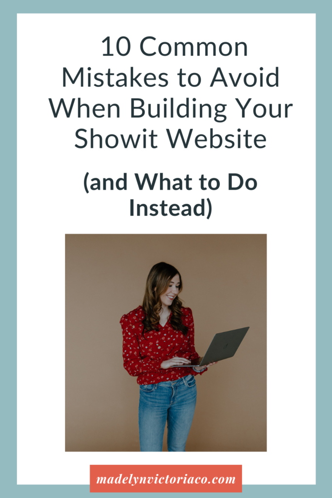
Building a website on ShowIt is one of the most exciting parts of growing your business—but it can also be one of the most overwhelming.
A website is supposed to show off your brand, speak to your dream clients, and help bring in more income. (No pressure, right?)
Here’s the good news, though: ShowIt makes it so much easier to create a gorgeous, strategic website thanks to its drag-and-drop design freedom and seamless WordPress integration for blogging.
But even with the best tools, I still see some common mistakes that can keep a beautiful website from actually working the way it should.
So, let’s sit down and walk through 10 of the most common ShowIt website mistakes—and more importantly, what you can do instead.
Whether you’re DIY-ing your site or working with a website designer, these tips will help you build something that not only looks amazing but gets results too.
1. Focusing on Pretty Instead of Purpose
It’s easy to get wrapped up in the visual side of website design—choosing fonts, colors, and layouts can be so much fun. But if your website doesn’t guide your visitors toward a clear goal, you will lose clients. You want your site to look good—but also work hard.
What to do instead: Start with the end in mind. Ask yourself: what do I want visitors to do on each page?
Are you trying to book more discovery calls? Sell digital products? Build an email list? Once you’re clear on the goal, every design decision should support it—from how your homepage is structured to what copy goes on your buttons. Strategy comes first, style comes second.
2. No Clear Call-to-Action (CTA)
If you don’t ask your visitors to take action, they’ll just keep scrolling—or worse, leave. Your website should guide people from “just looking” to “yes, I want to work together!”
Just imagine walking into a boutique where no one greets you, offers help, or tells you where to check out. What would happen?
I know I would get frustrated, leave, and wouldn’t recommend it to my friends.
That’s what a website without clear CTAs feels like. You’re leaving visitors to figure things out on their own—and most of them won’t stick around long enough to try.
What to do instead: Every single page should have a clear, compelling CTA.
Think “Book Your Free Discovery Call,” “Grab the Free Guide,” or “Browse My Packages.” Be specific. Generic buttons like “Learn More” aren’t nearly as effective.
And don’t just put your CTA once—repeat it at the top of the page, mid-scroll, and at the end so there’s always a clear path forward.
3. Forgetting About Mobile Design
Raise your hand if you’ve ever designed a whole page on your desktop, then looked at it on your phone and went, “Yikes.”
You’re not alone. Over 50% of your site traffic is probably coming from a phone web traffic now comes from mobile devices, so your ShowIt website has to shine on both screens.
What to do instead: After building a page, switch over to ShowIt’s mobile view and customize it there.
You can adjust text sizes, reposition elements, and tweak spacing to make sure everything feels easy to read and navigate on a smaller screen.
Think about your visitor’s experience—can they quickly find what they need and take action from their phone?
Pro tip: Don’t forget to test every page on your actual phone before you launch. Not just the homepage—every page.
4. Overwhelming Navigation Menus
Let’s talk about your website’s menu. If it’s cluttered or confusing, people will get lost—and leave.
I once worked on a website that had two menus (one on top of the other). My clients told me that they couldn’t figure out why people kept bouncing! But I saw the problem right away: people had no idea what to look at. The menu had way too many options, so they felt overwhelmed with where to go. Don’t let this be you!
What to do instead: Keep your main navigation clean and simple. Ideally, you want 5–7 top-level menu items. If you have more content to share, use dropdowns wisely or link to additional resources from your footer or blog.
Focus on guiding people to the most important pages: Home, About, Services, and Contact are a great start.
Think about what your ideal client is actually looking for—and make it easy to find.
5. Ignoring SEO Basics
ShowIt is super SEO-friendly, but it doesn’t magically do the work for you. If you skip the SEO essentials, you’re missing out on free traffic from Google (and we love free traffic!).
What to do instead: SEO doesn’t have to be scary. Start with these basics:
- Add keyword-rich page titles that reflect what your audience is searching for (e.g., “Showit Website Design for Coaches”)
- Write meta descriptions that are compelling and include your main keywords
- Use alt text for all images so search engines know what’s on the page
- Use headings (H1, H2, etc.) with keywords to structure your content
- If you blog (which I highly recommend), optimize posts through WordPress using keywords your ideal clients would search
Not sure where to start with keywords? Use tools like Ubersuggest or Google’s autocomplete to find phrases like “best website platform for small businesses” or “how to build a coaching website.”
6. Using Blurry or Overused Stock Photos
First impressions matter. If your photos feel generic or low-quality, visitors might assume your services are too (even if they’re amazing).
We’ve all seen it: the handshake photo, the fake laptop coffee shop setup, or the woman laughing at salad (yes, this is an actual stock photo I’ve seen).
These kinds of stock photos don’t just feel inauthentic or staged—they actively push potential clients away.
What to do instead: Invest in brand photography if it’s in your budget—it’s worth every penny.
If not, you can still create a beautiful visual experience using high-quality stock photos that align with your vibe. Some great options: Pexels, Unsplash, and Haute Stock.
Look for collections that feel modern, minimal, and personal. And always resize your images properly in ShowIt to avoid blurriness.
Pro tip: Don’t forget to include real photos of you on your website. People want to connect with a human. Even a few friendly, professional shots can build trust and credibility.
7. Blending In Instead of Standing Out
There’s a lot of copy-and-paste messaging in the online space.
“Helping you live your best life” sounds nice, but it doesn’t tell people what you actually do or why they should hire you.
Let’s be honest—your industry is probably crowded. And while there’s room for everyone, the businesses that stand out online are the ones that embrace what makes them different.
What to do instead: Get specific. Tell your audience what makes you different. Do you bring strategy and design together?
Do you help clients double their inquiries through their websites? Say that! Show your personality and your process.
Your voice, your story, your approach—those are the things that help dream clients feel connected to you.
Avoid generic phrases and use words your audience would actually say. Highlight your process, your client results, and your values.
8. Having an Empty (or Nonexistent) Blog
Yes, blogging still matters—especially if you’re trying to boost visibility and grow your site traffic over time.
But hear me out: it’s one of the best long-term marketing tools you can use. Blogging helps with SEO, showcases your expertise, and gives you tons of repurposable content for social media and emails.
What to do instead: Commit to one blog post a month (or even every other month) that your audience is already Googling like: “How to book more clients through your website,” “Best website platforms for coaches,” or “Tips for writing website copy that converts.”
Use your ShowIt site with WordPress to publish and optimize your blog content for search.
And don’t forget—Showit’s integration with WordPress makes blogging super smooth and powerful for search engine visibility.
9. Trying to DIY Everything Without a Game Plan
Like I mention earlier, lots of people opt to DIY their website.
But the most common trap I see is spending hours on Canva mood boards and tweaking font sizes without a real plan—and ending up with a website that feels scattered or half-finished.
Without a clear strategy, it’s easy to go down a rabbit hole of endless tweaks, second-guessing, and wasted time.
What to do instead: Start with strategy. Know your goals. Then map out your sitemap, page structure, and copy before you open the ShowIt editor.
Better yet, use a high-quality ShowIt template that comes with built-in strategy—or partner with a designer who can help you bring your vision to life.
It doesn’t have to be a full custom build; even a VIP day can get you up and running fast with the right strategy behind it.
10. Launching Without Testing
You’ve built the site. You’re ready to share it with the world.
You finally hit “publish”… and then someone messages you that your contact form is broken. Yikes!
We don’t want people to get frustrated or think we’re unprofessional when a link doesn’t work or we forgot to include a really important detail.
What to do instead: Block out a solid hour (or more) to walk through your entire site like you’re a brand new visitor. Click every button. Fill out every form.
Read every word. Look for typos, spacing issues, broken links, and anything that feels clunky or unclear. Bonus: have a friend or business buddy test it, too. They’ll notice things you’ve stopped seeing.
A smooth, seamless experience builds trust—and trust leads to conversions.
Final Thoughts
Your ShowIt website is one of the most important tools in your business. It’s your online home, your first impression, and your hardest-working team member. But it only works for you when it’s built strategically.
Avoiding these common mistakes can save you a ton of time, money, and “why isn’t this working?!” moments.
And if you’re ready to stop guessing and finally build a website that looks amazing and drives results, I’d love to help.
Let’s Build a Website That Does the Heavy Lifting
Whether you need a custom design, a strategic refresh, or help refining your DIY site, I’m here to support you.
Let’s build a Showit website that reflects your brand, speaks to your ideal audience, and works around the clock to grow your business.
Click the link to book a free discovery call and let’s bring your vision to life: https://madelynvictoriaco.com/website-design

Madelyn is the owner of Madelyn Victoria Co. She’s a social media manager and ShowIt designer who helps service providers stand out online with a people-first strategy.
Madelyn believes your marketing should fuel growth, not drain your energy. Through strategic social media content and high-converting websites, she’s helped entrepreneurs get visible, build trust with their audience, and increase revenue by consistently attracting the right clients.


+ show Comments
- Hide Comments
add a comment